
"We Tried to Warn You"
"We Tried to Warn You"
Some musings on power, posters, and environmental admonishment

On an A train ride to Brooklyn Bridge Park back in January, an eye-catching graphic of Porky Pig in a gas mask caught my eye — bit more sinister than the ads for ApartmentDeco or Muzz or CUNY that abound on the subway. Further examination revealed it was promoting an exhibit, “We Tried to Warn You: Environmental Crisis Posters, 1970–2020.” If you’ve lived or shared an office space with me for more than a few weeks, it becomes evident fairly quickly that I love ephemera. I love a playbill, a ticket, an airplane boarding pass, a business card, the everyday whim-wham and detritus of life. And I have been known, upon occasion, to take a poster off a street sign or a bulletin board if it’s of particular visual interest. After some Googling, I grew more intrigued by the framing of the exhibition, the admission in the marketing copy that “Every poster in this exhibition is a failure —not in the sense that they failed in their graphic intent of communicating a message, but rather that they failed to successfully modify behavior. Almost all of the environmental issues showcased in these posters remain or have worsened.” So on a brisk Sunday afternoon, I made my way to Poster House, accompanied by my friend Ben, a fellow museum-nut and environmental communications wonk.

The show, situated in the museum’s smaller basement exhibition space, features 33 works (mostly posters but the occasional button and a pair of Vivienne Westwood socks, if you can believe it). Curator Tim Medland organized the objects according to the four elements — Earth, Water, Air, and Fire. The exhibit opens with a quote from Richard Nixon’s State of the Union address in 1970, where he frames the environmental concerns that would lead his administration to found the Environmental Protection Agency later that year, and generally seems to argue1 that visual culture and propaganda has been part and parcel to the environmental movement since the founding of its modern iteration in the US in 1970, even if its messaging has seen less than stellar results.
One of the most informative pieces in the show for me was a visual from the “Keep America Beautiful” campaign, which featured a man, positioned as stereotypically Native American (but, as the wall text notes, who was actually an Italian actor in brown face) gazing at the viewer with both admonishment and wistfulness. One of the slogans for the campaign, which in addition to posters featured video public service announcements, was “People start pollution, people can stop it,” which, as readers of this newsletter should know well, is the kind of emphasis on individual action that intentionally distracts from the need for corporate regulations. The wall text offers further context that this ad is one of the first examples of corporate greenwashing, an issue that hits home more than usual this week, shortly after the release of a Guardian article on how the plastic industry deliberately tried to encourage recycling of single-use plastics while knowing good and well that it’s not actually recyclable in the way that metal or paper is.
Another more contemporary piece featuring Sesame Street’s Count von Count by artist Winston Tseng caught my eye for the same reason the Porky Pig graphic did in the ad I saw for the show. The subversion of a familiar character or logo is one of my favorite forms of visual satire, but the message falls flat for me the same way the Union Square Climate Countdown Clock does — without a call to action, what is a mere awareness of my impending doom supposed to do?
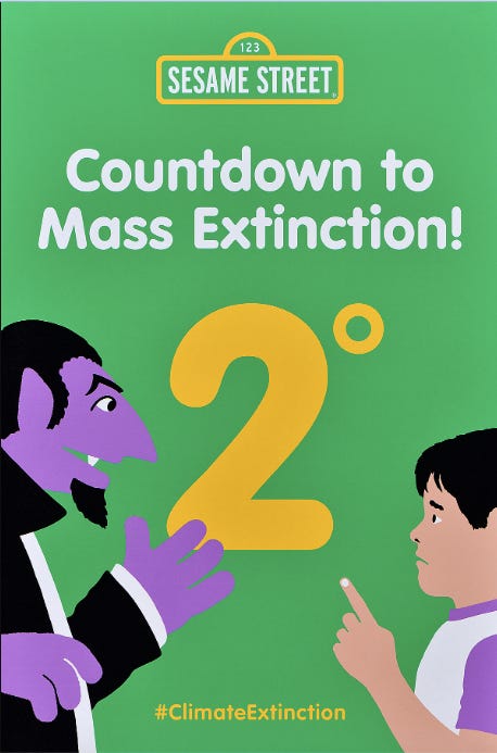
The Count Von Count piece also lacks the oomph that it likely had in real life; Tseng illegally (a word I use with my compliments rather than admonishment) plastered them on bus stops across New York City where passerby might encounter them on a commute. This speaks to a broader issue with the Poster House’s exhibition style writ large — posters are beautiful to me in part because of their mobility, their ephemerality. In their present iteration, they’re framed with robust wall text but divorced from their broader cultural context, as Ben pointed out when we reached the larger upstairs exhibition on the commercializing of Art Deco, which featured a wall-sized photograph of one of the posters on display in its sidewalk setting. Some of this is curatorial intent and some is space constraints, I’m sure, but as is, I’m left wondering who these posters supposed to be speaking to. Are they supposed to be in a classroom, encouraging children to become environmentally conscious? In a board room, soothing corporate overlords? Held aloft at a march or a rally?
Because as I browsed through the gallery, I kept looking for the kind of visuals that spoke to the popular environmental movement that I’ve been a part of. Where were the anti-nuclear sandwich boards? Where were the block letters declaring “Water is Life” that helped define Standing Rock for a national audience? Not that I love Extinction Rebellion, but where was its angular hourglass logo (a much more familiar logo than a theta-like symbol that neither Ben nor I had seen before that is apparently some sort of “ecology logo2”).
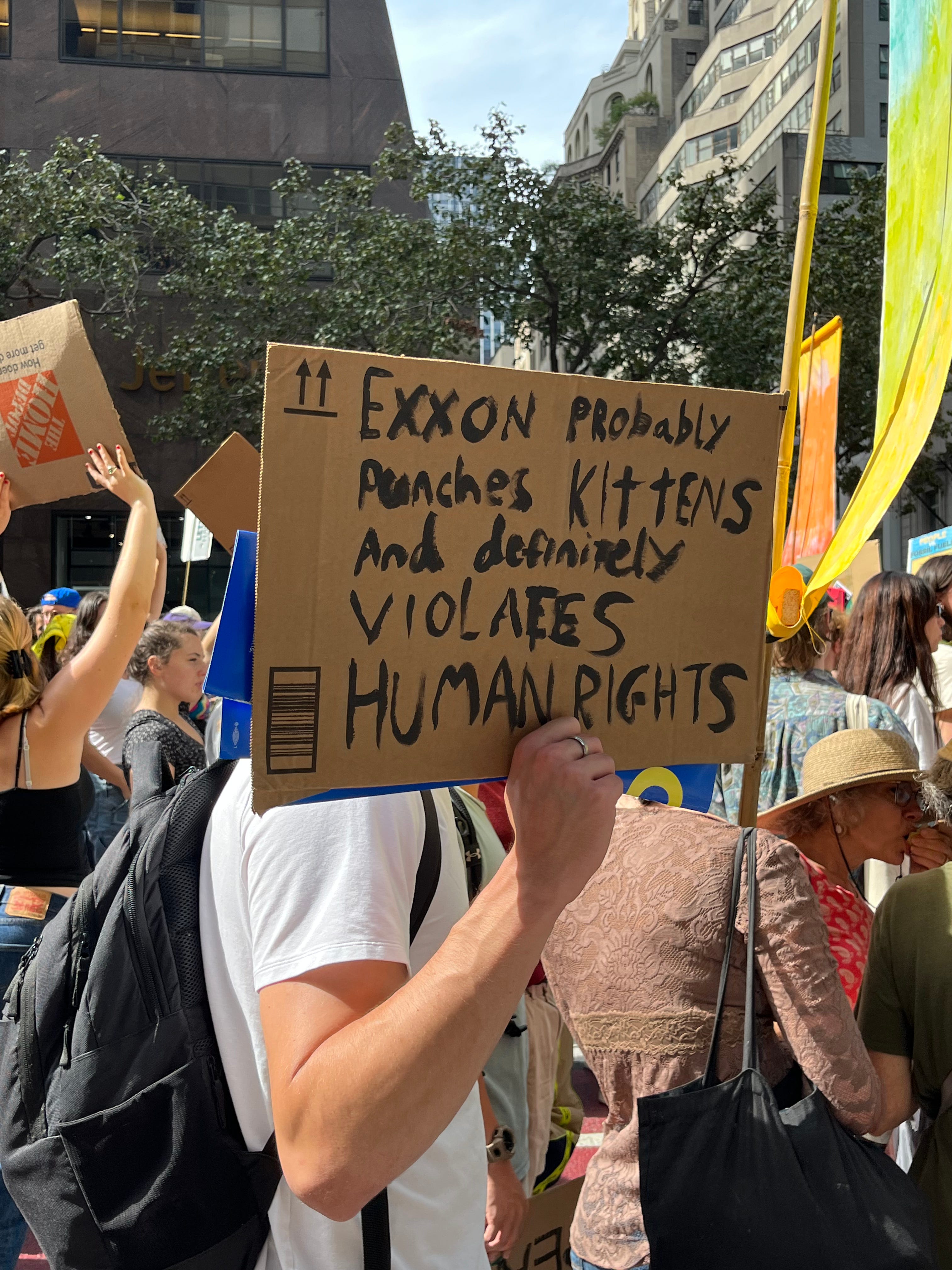
The Trump Era brought about an era of liberal feminist dissent that brought certain handmade elements of visual protest culture into vogue. Whether it was the knitted Pussy Hat or the “This episode of Handmaid’s Tale sucks” signs, there’s a certain kind of gotcha wittyness that I find exhausting (perhaps because it’s so frequently used by members of the Democratic Party who use rhetoric and digital virality to hide the fact that in our two-party system, both parties are deeply interested in the preservation of capital, but I digress). But at their best, these kinds of posters return me to what I love about ephemera – the mark of the human. The frustration that can only be expressed by taking to the streets without the time to mock something up in InDesign or knit a hat, but is instead scrawled in Sharpie, even if my handwriting sucks.
It must be said that the environmental movement, like all movements for social justice, has been led and shaped first and foremost by popular mobilizations and then co-opted and shaped into public policy and information campaigns. And one of the greatest tools that we have at our disposal is the poster. A piece of cardboard you meant to recycle but lingered by the trash can, one marker, and your own two hands, held outside the United Nations until your biceps start to burn. A poster bearing Refaat Alareer’s poem “If I Must Die” wheatpasted over a Tinder ad on a subway platform. That isn’t to say that popular movements haven’t had beautiful, labor-intensive artwork behind them, but that that artwork must be where the people are.
Without a sense of who is speaking and who is being spoken to, the title, “We Tried to Warn You,” falls flat. Who tried to warn whom? Many of the posters were produced for non-profit or governmental campaigns — the World Wildlife Fund, a municipal Earth Day, the UN Earth Summit. Their glossy manufacture reflects this. At multiple points the materials for the show call the posters they exhibit examples of “environmental activism,” but can we really call a campaign designed in this fashion activism? What does it mean to give a warning when the same bodies that are supposedly doing that warning could do something more meaningful than merely just warn? And whose failure, the admission of which that brought me into the museum in the first place, is it that the posters didn’t succeed?
If you’re in New York, you can check out the exhibit for yourself before it closes on February 25 (hence why this newsletter is a couple days early) - it’s free on Friday. I do recommend it for a good bit of critical thinking on the ways we communicate the urgency of our times to broader publics and to one another.
Currently reading: James by Percival Everett
Spinning: “In the Next Life” by Kim Petras
There’s a great line in the Fast Company review of the exhibit that calls it “nuanced if inconclusive.”
Credit where credit is due: Designed by editorial cartoonist Ron Cobb, the logo was designed in 1969 and meant to evoke a lowercase “e,” for Earth, inside a circle. It appeared for the first time in the issue of Look magazine, where he worked at the time, as part of their commemoration for the first Earth Day and became adopted more widely by environmental advocates. That said, it looks more like a theta to me (which the wall text at the gallery said is supposed to evoke death? Thanatos?), and I don’t believe I’ve come across it before.